A Valore é uma imobiliária Belo Horizontina que possui décadas de experiência no mercado, gerindo imóveis residenciais e comerciais.
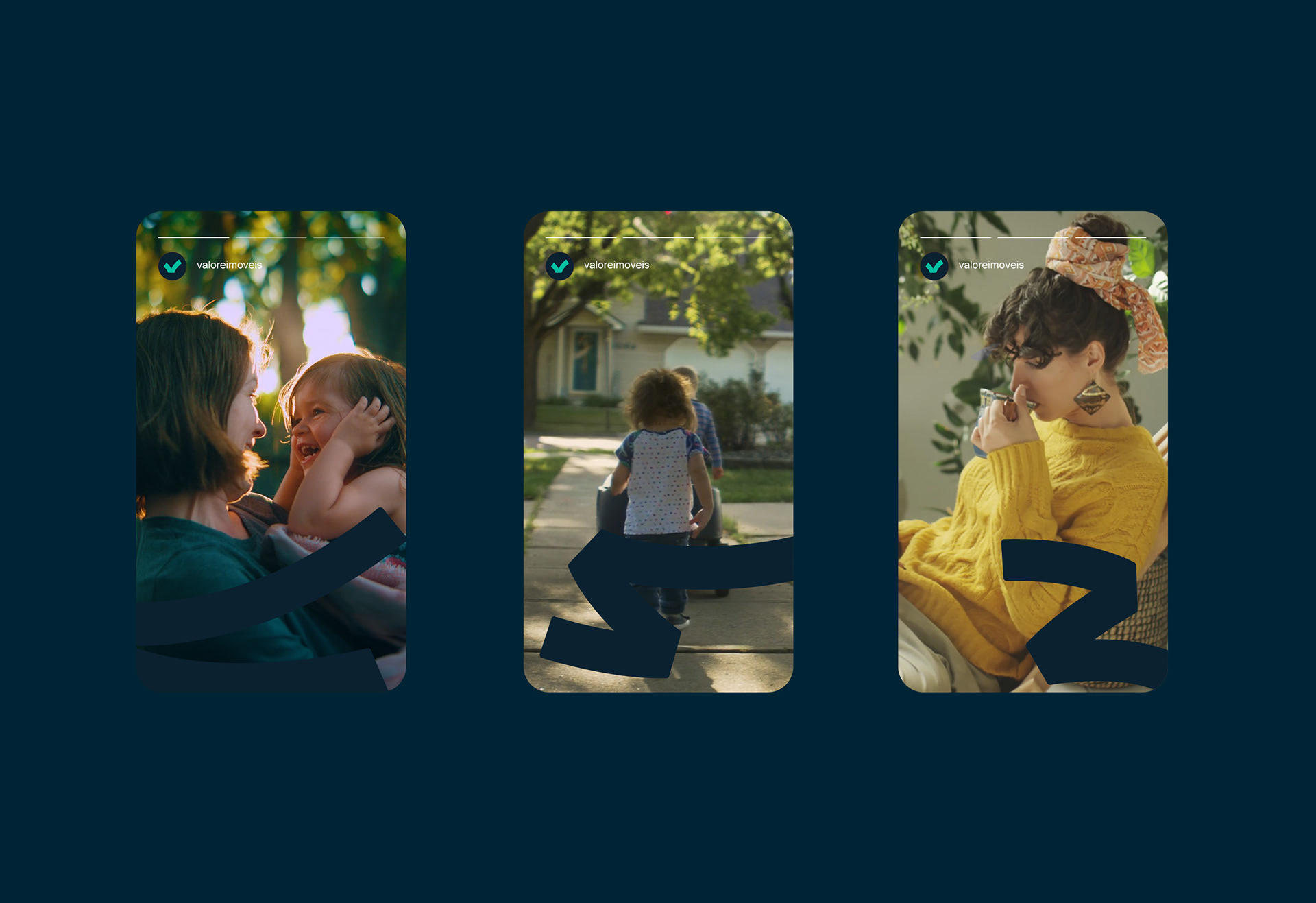
Nosso desafio foi trazer a marca para um novo panorama global, em que a velocidade dos processos é muito grande, mas ainda há um forte desejo por relações mais próximas e humanas, visto que a digitalização vivida com intensidade no pós-pandemia acabou tornando os processos frios e impessoais em excesso.
Após um cuidadoso trabalho de branding, a marca se reencontrou com suas raízes e construiu um novo posicionamento, mais humano e próximo das pessoas, sem, contudo, abdicar das facilidades trazidas pelas inovações tecnológicas.
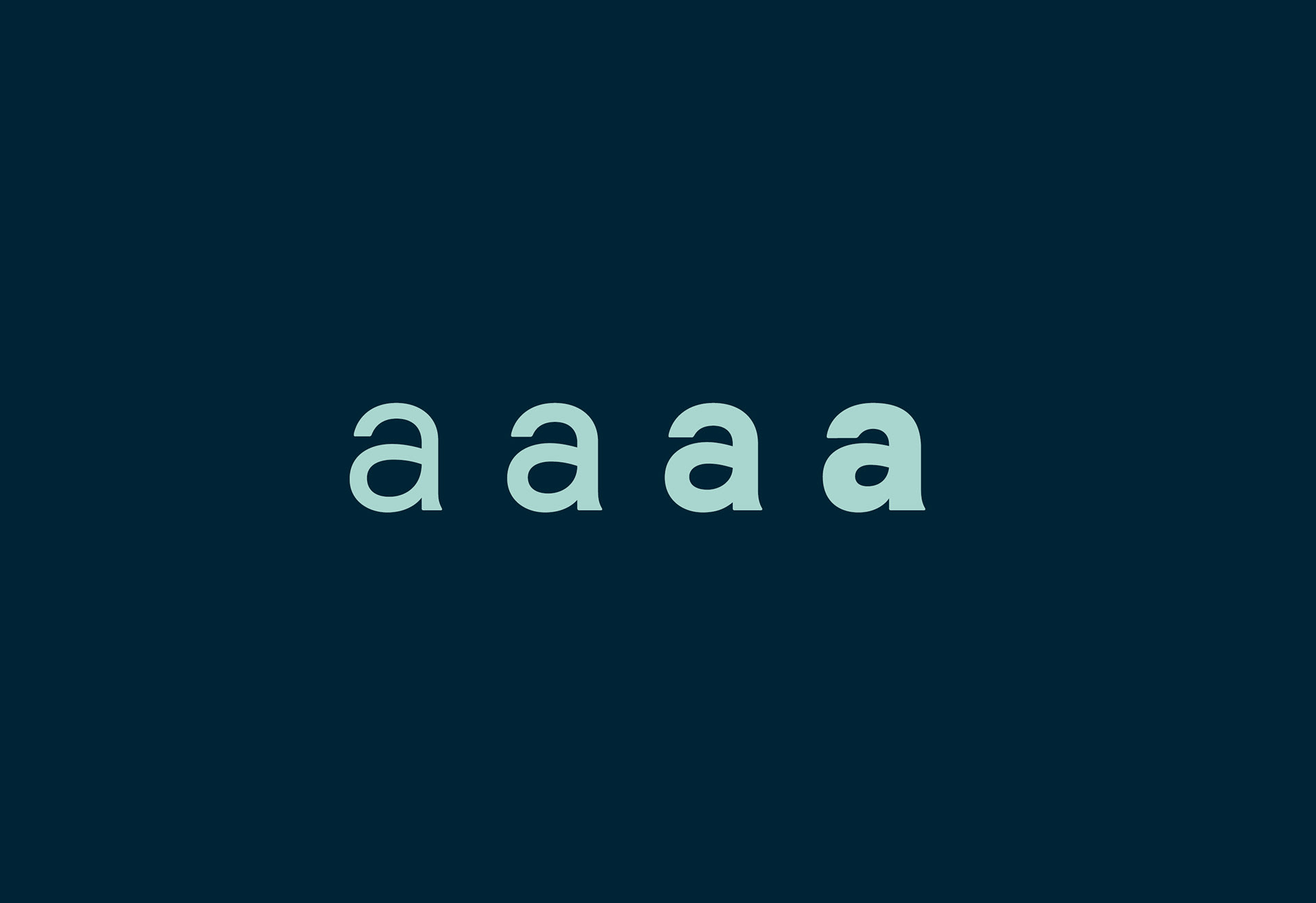
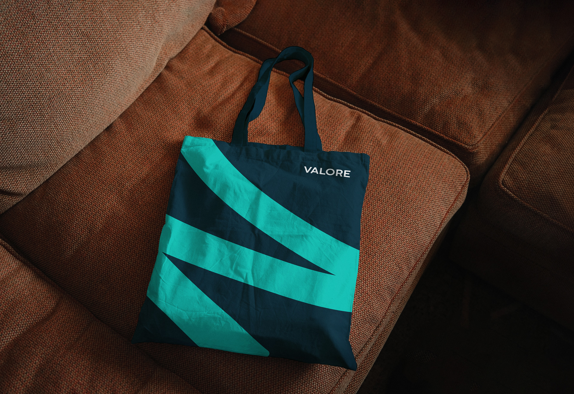
Para o logotipo, uma construção geométrica clássica, suavizada por cantos arredondados e leves correções visuais. O baixíssimo contraste, cor escura (visualmente) e altura de x alta garantem impacto e legibilidade. O símbolo foi construído tal qual uma tipografia humanista, onde os traços apresentam um contraste leve, mas existente, fruto de sua herança caligráfica.
Afinal, aqui, o morar se escreve a mão.
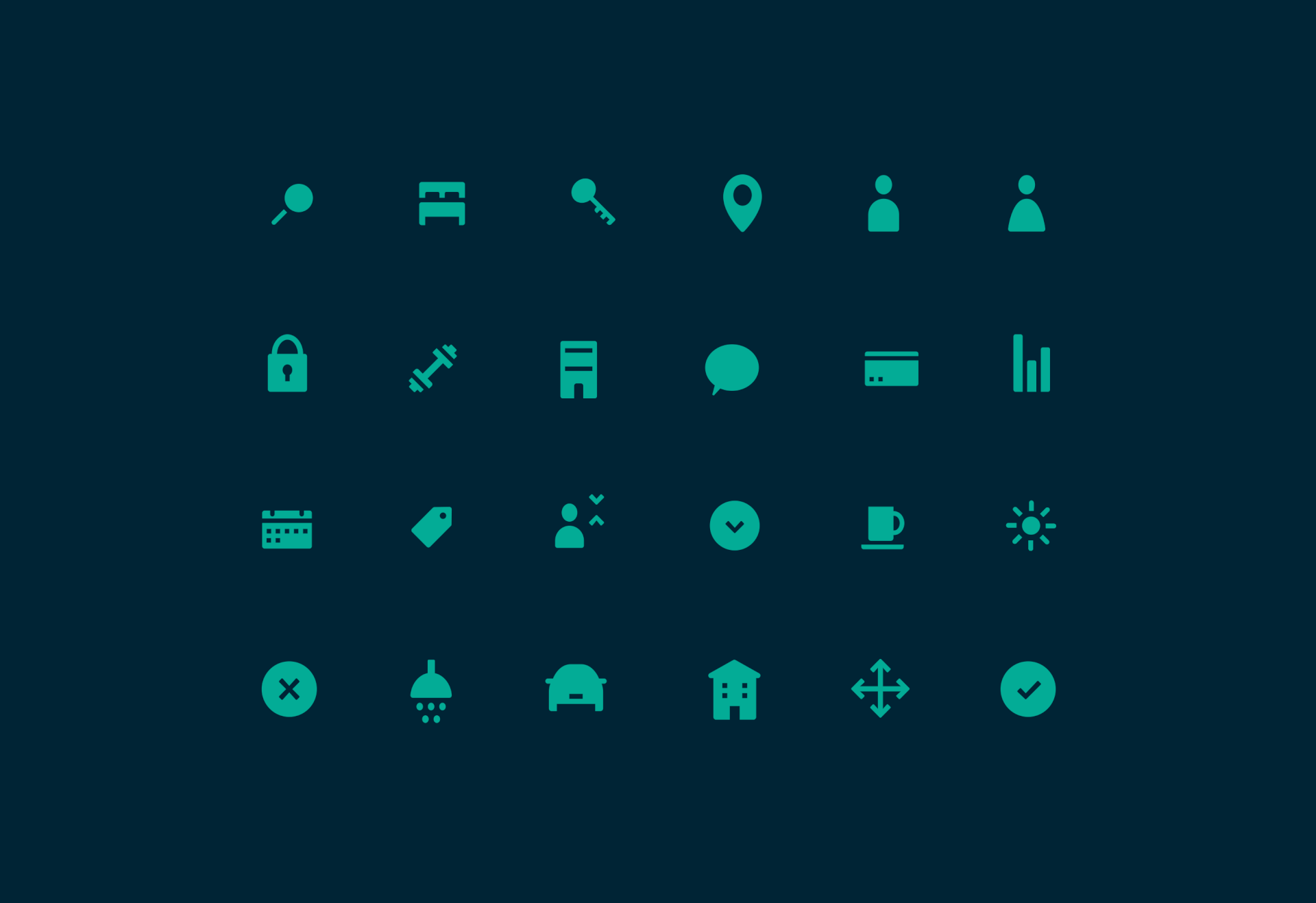
Para finalizar, uma família de ícones em dois tamanhos óticos distintos para pequenas e grandes aplicações (uma espécie de display e text para a iconografia) e um código morfológico animado tangibilizando a essência da Valore.
Valore is a real estate agency that has decades of experience in the market, managing residential and commercial properties.
Our challenge was to bring the brand into a new era, in which the speed of processes is very high, but there is still a strong desire for closer and more human relationships, given that the digitalization experienced with intensity in the post-pandemic ended up making processes cold and excessively impersonal.
After careful branding work, the brand rediscovered its roots and built a new positioning, more human and closer to people, without, however, giving up the facilities brought by technological innovations.
For the logo, a classic geometric construction, softened by rounded corners and slight visual corrections. The very low contrast, dark color (visually) and high x-height guarantee impact and readability. The symbol was constructed like a humanist typography, where the lines present a slight but existing contrast, the result of its calligraphic heritage.
To finish, a family of icons in two different optical sizes for small and large applications (a kind of display and text for iconography) and some animated drawings.
Direção de design: Artur Zingoni e Marcela Cardoso
Design: Artur Zingoni, Marcela Cardoso, Raquel Guimarães e Laura de Menezes
Motion: Klayton Fadul