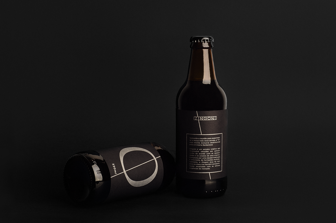
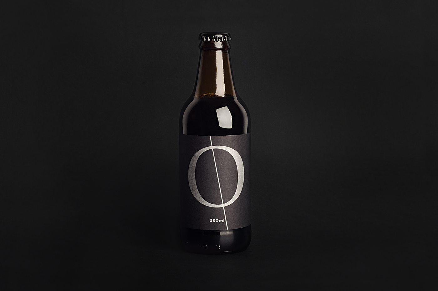
"O" - In honor of Typography
The "O" Beer was born from the desire of the Zingoni Studio to have more productive and inspiring meetings in the year 2017. Its exclusive recipe, developed by the renowned Barbarossa brewery, uses typical local ingredients.
The classic typography has always been a passion of the studio and therefore, was chosen as the field of knowledge honored by the new line of beers.
During the development process, it was shown that a return of the traditional printing technique would represent the development of the Typography. We worked in partnership with the famous Typographer Ademir Matias to make a revivel, once again, through the technique of Letterpress.
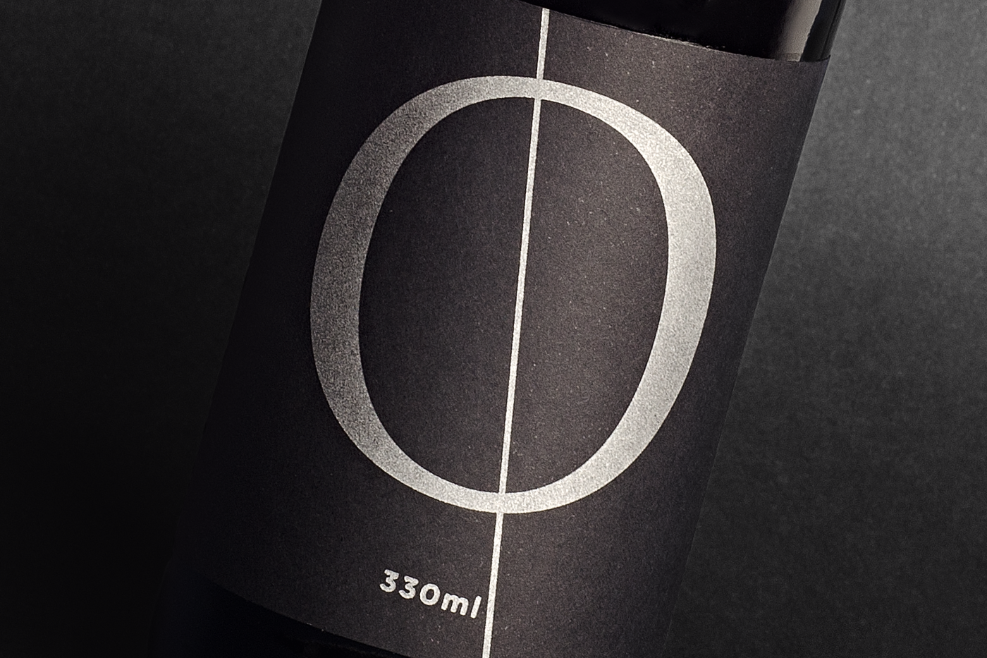
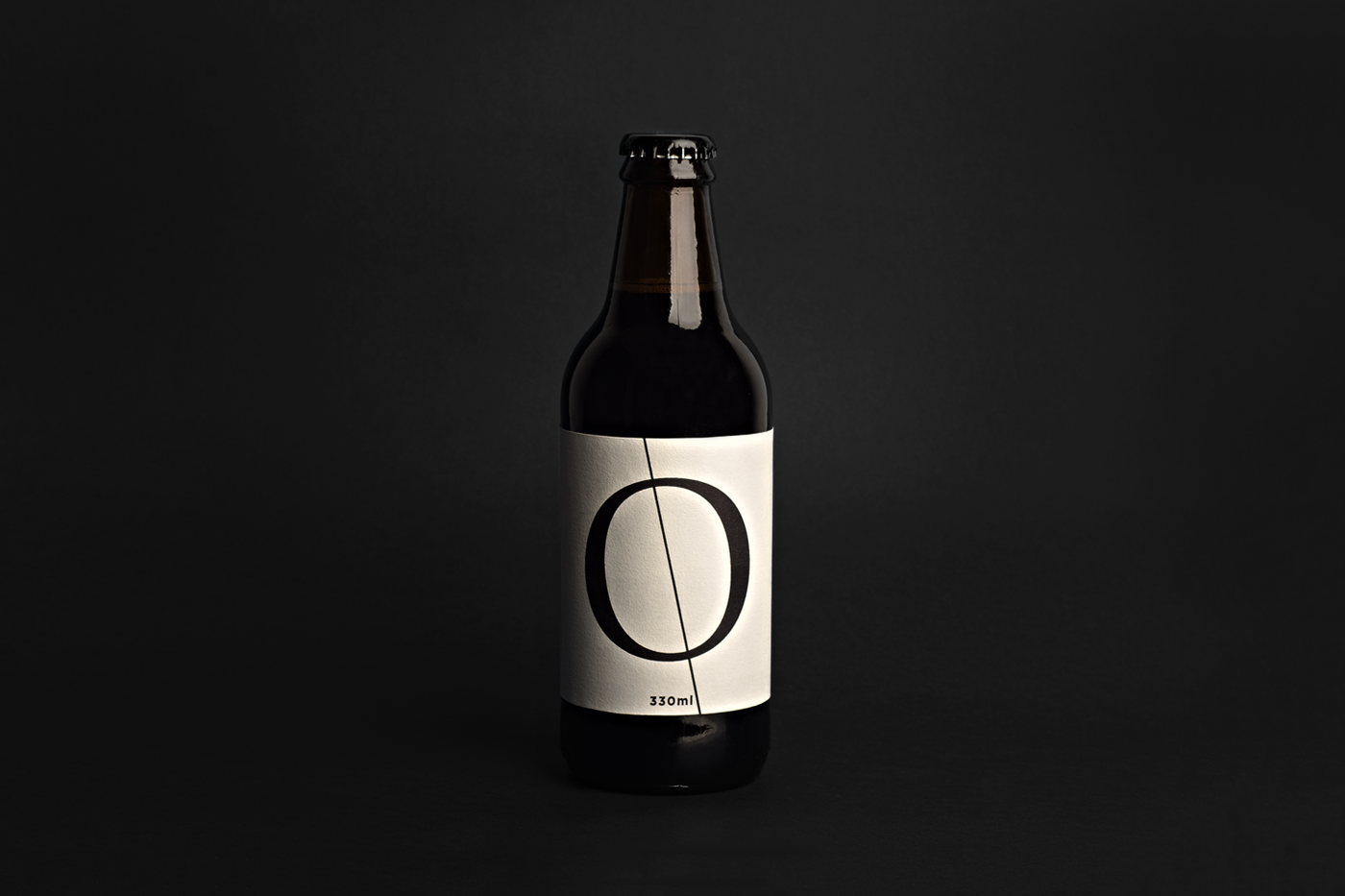
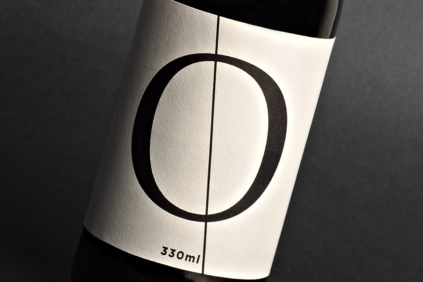
For the design, we chose the letter "O" of a classic type, from the category of Garaldes, with its respective axis, almost entirely vertical, although not yet rational. The use of an uncoated Fedrigoni paper, together with the matte silver paint, contributed to emulate the classic mood.
The classic typography has always been a passion of the studio and therefore, was chosen as the field of knowledge honored by the new line of beers.
During the development process, it was shown that a return of the traditional printing technique would represent the development of the Typography. We worked in partnership with the famous Typographer Ademir Matias to make a revivel, once again, through the technique of Letterpress.
For the design, we chose the letter "O" of a classic type, from the category of Garaldes, with its respective axis, almost entirely vertical, although not yet rational. The use of an uncoated Fedrigoni paper, together with the matte silver paint, contributed to emulate the classic mood.
A Cerveja “O” nasceu da vontade do Estúdio Zingoni de ter reuniões mais produtivas e inspiradoras no ano de 2017. Sua receita exclusiva, desenvolvida pela renomada cervejaria Barbarossa, privilegia ingredientes tipicamente locais.
A tipografia clássica sempre foi uma paixão do estúdio e por isso, foi escolhida como o campo do saber homenageado pela nova linha de cervejas.
Durante o processo de desenvolvimento, percebeu-se que um retorno a técnicas de impressão mais tradicionais, representaria toda a carga histórica e visual que a Tipografia ostenta. Assim, atuamos em parceria com o famoso Tipógrafo Ademir Matias para reavivar, mais uma vez, a nobre técnica da impressão tipográfica.
Para a arte, escolhemos a letra “O” de um tipo clássico, da categoria dos Garaldes e com eixo quase inteiramente vertical, embora ainda não racional. O uso de um papel Fedrigoni, não revestido, em conjunto com a tinta prata fosca, contribuiu para emular o clima clássico .